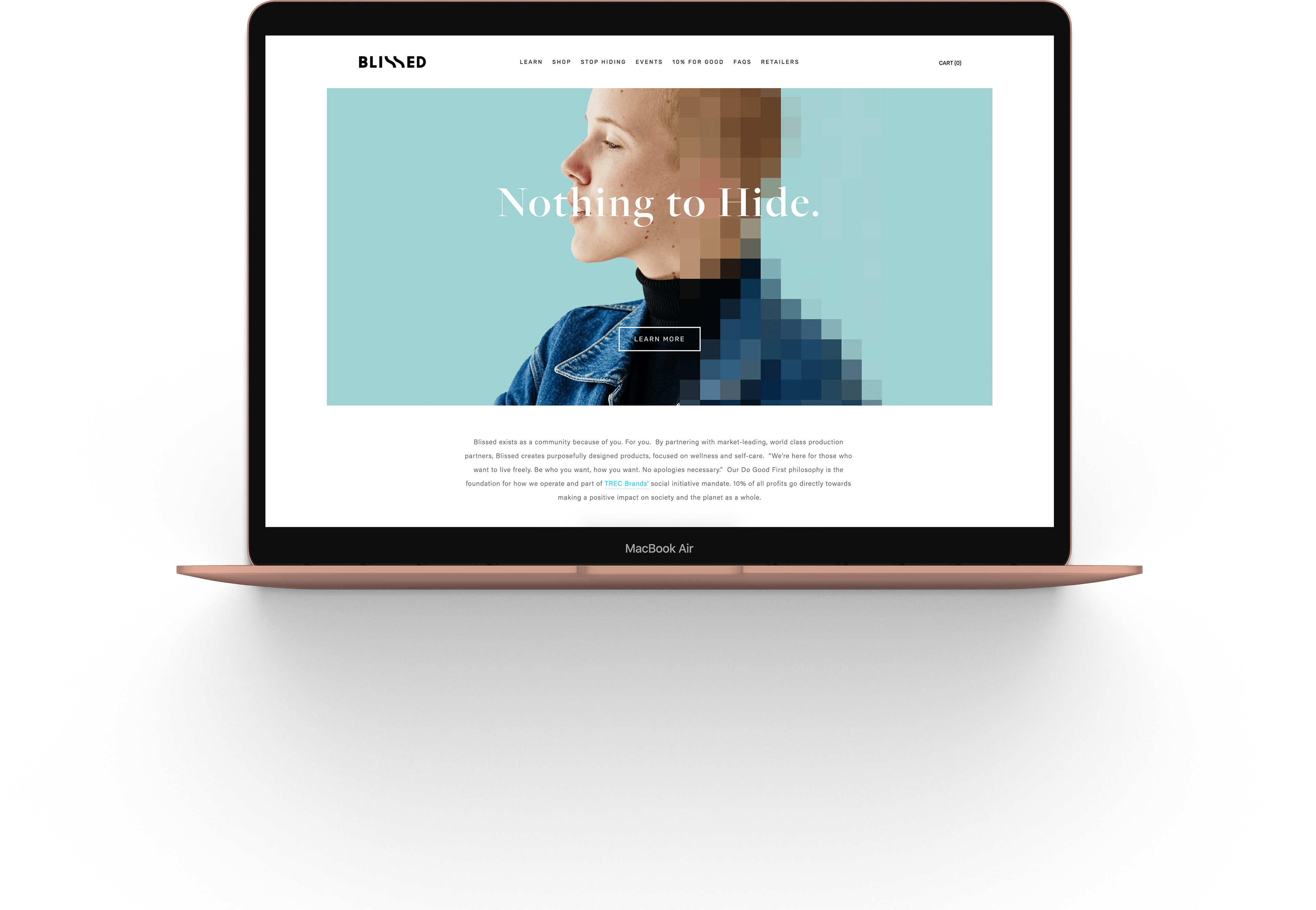

The Ask
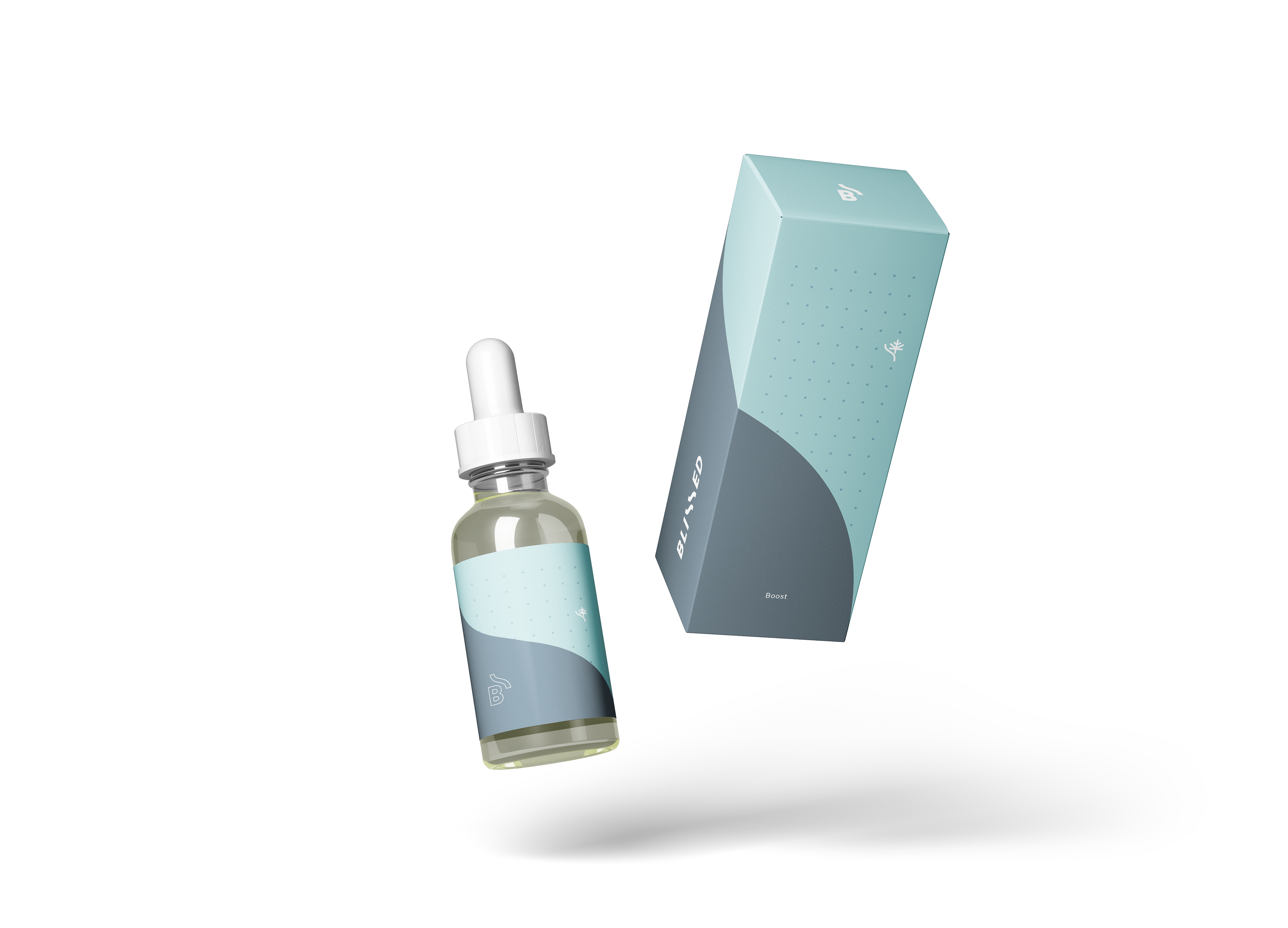
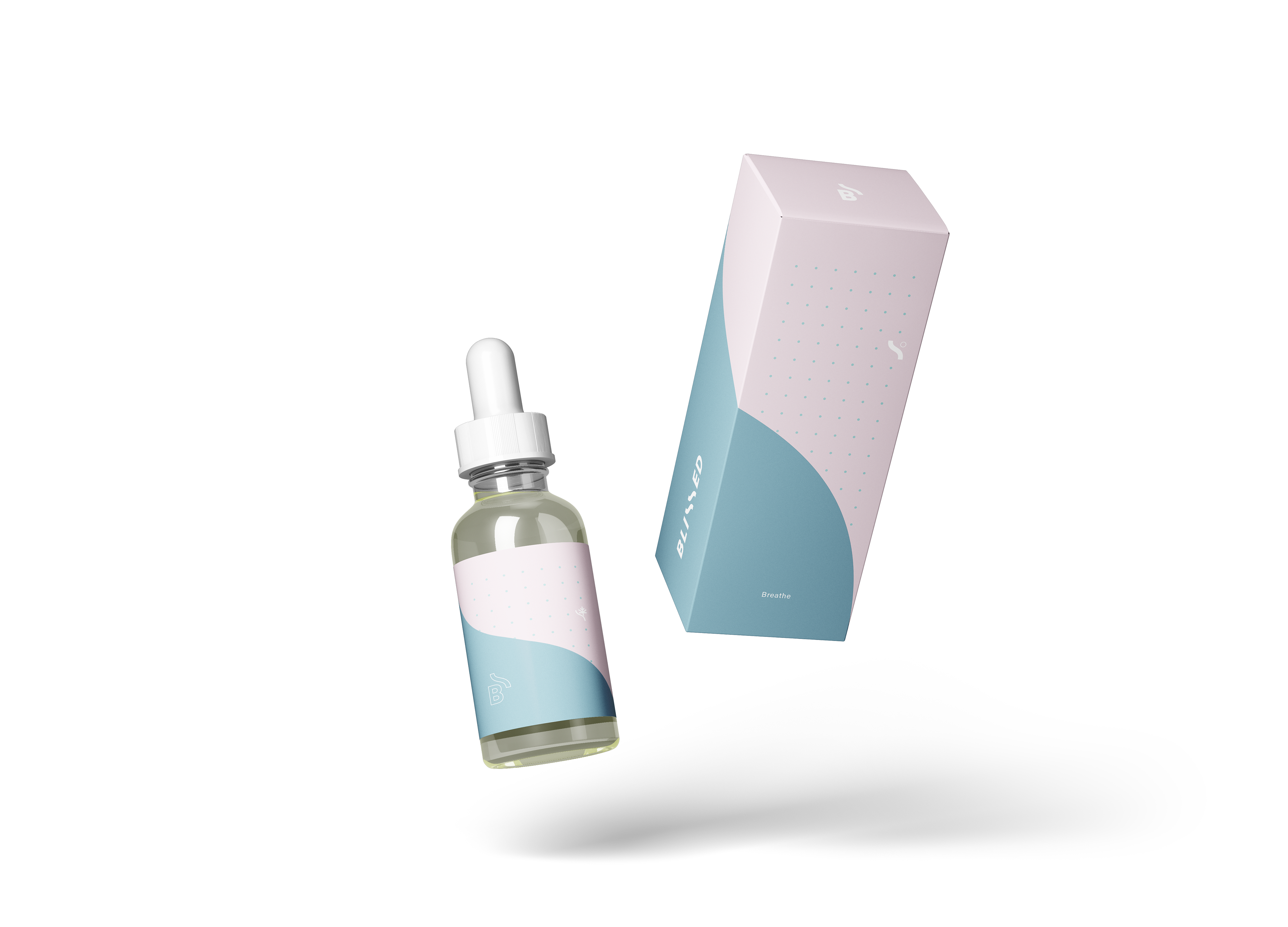
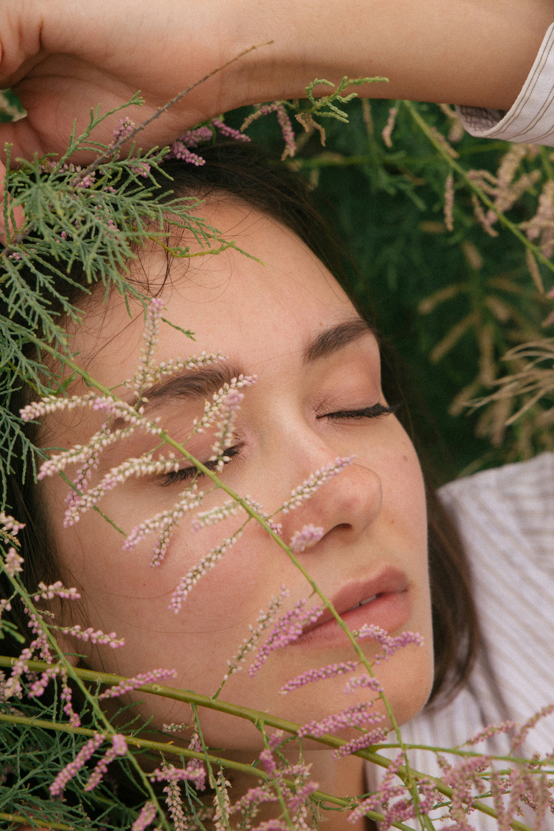
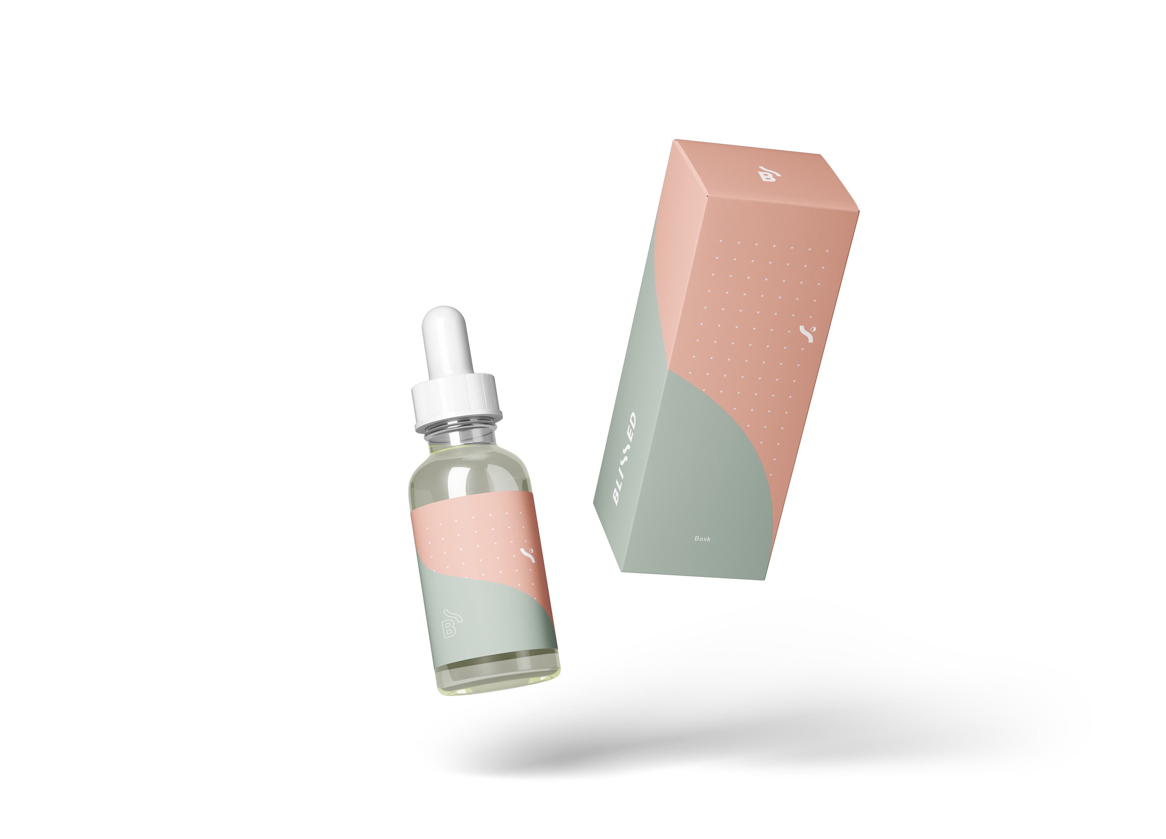
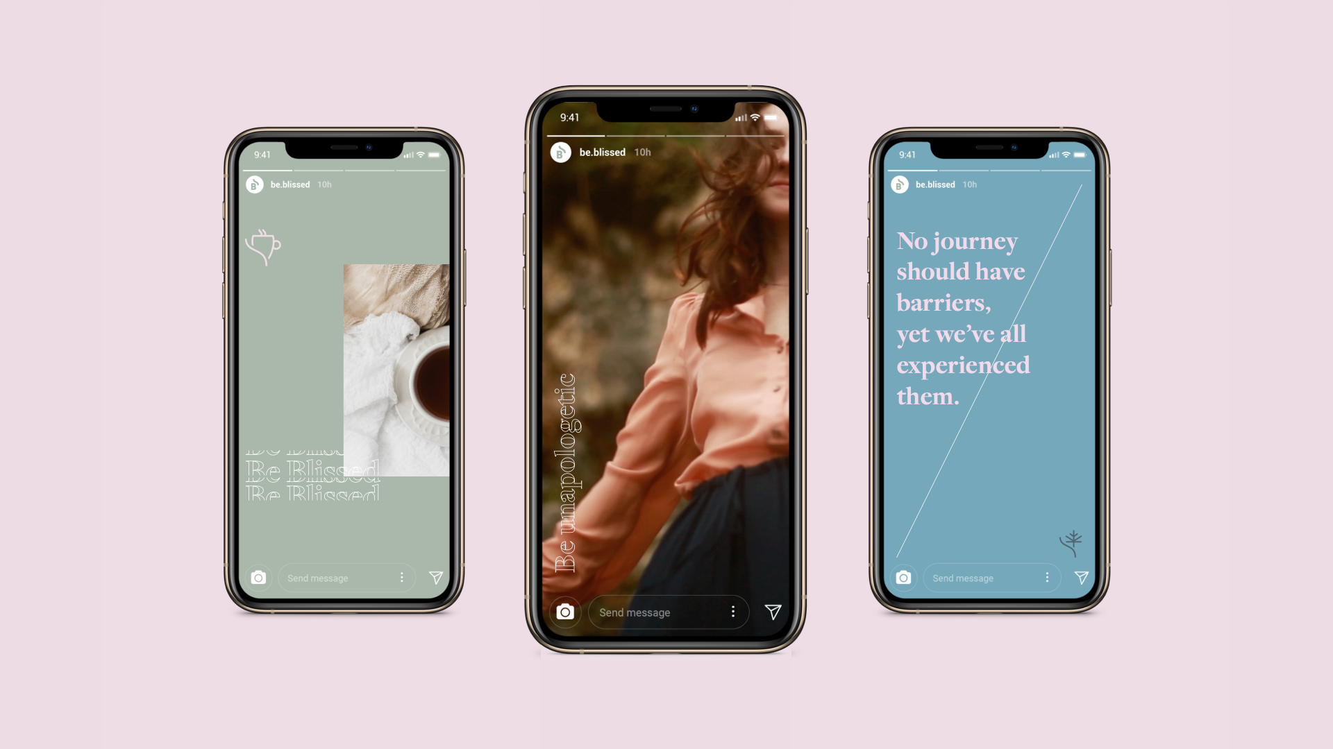
Develop a Brand Identity and Packaging for a Cannabis Oil. The Brand Identity created for Blissed lives and breathes its promise made to women. From meaningful colour palette choices to social media content guidelines, we created a distinct character and voice that resonated with the target audience. The authentic, inspiring brand for Blissed included beautiful product packaging, sales messaging, and an overall story that was much more than a logo.
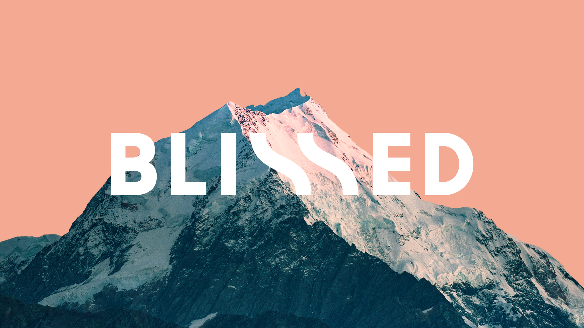
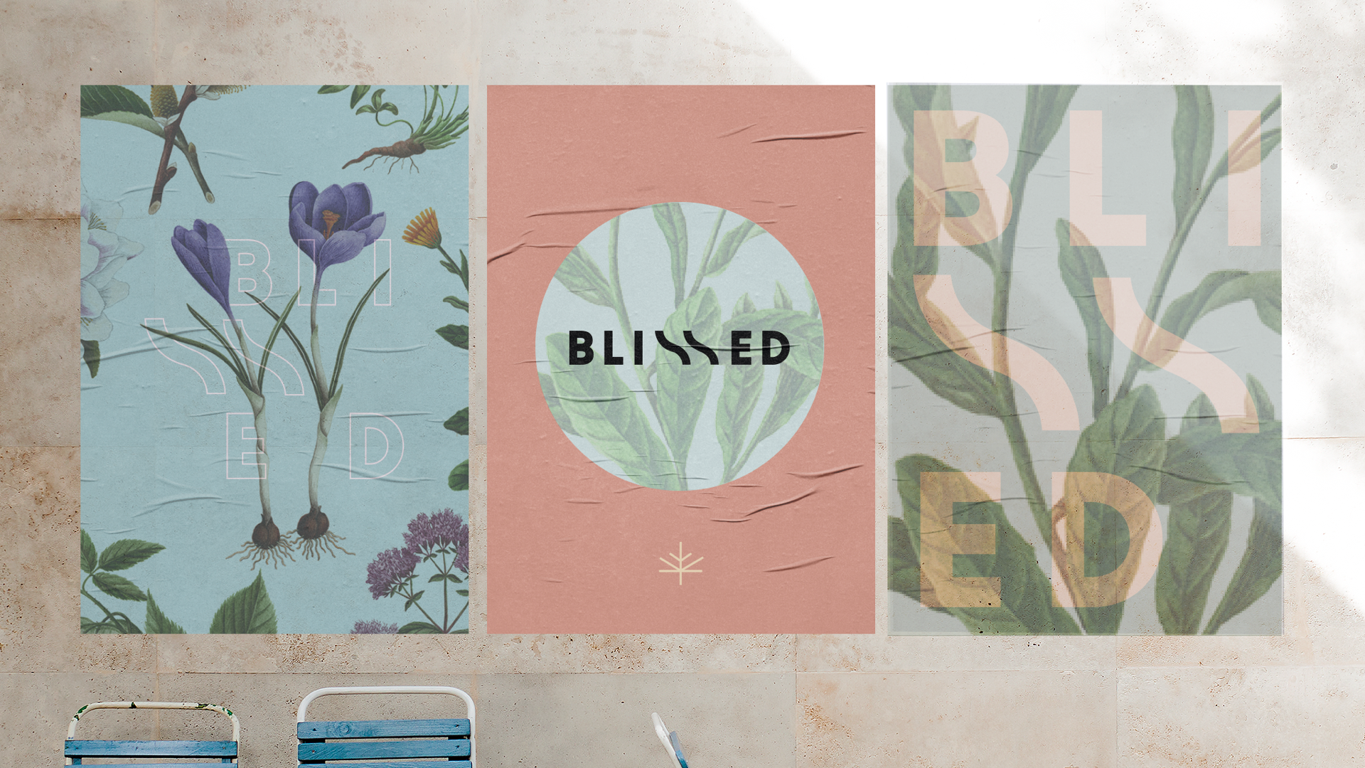
The Logo
The logo needed to be clean, minimal, and elevated. It needed to allude to the product without being obvious. This was not a brand for stoners - this was for new adopters. Women who were looking for new ways to connect with friends in a time where people are looking to consume less alcohol.
The logo is sleek and adaptable; it could be used horizontally, vertically, or as a stand-alone monogram. The blissed wave became a key visual used throughout the brand.

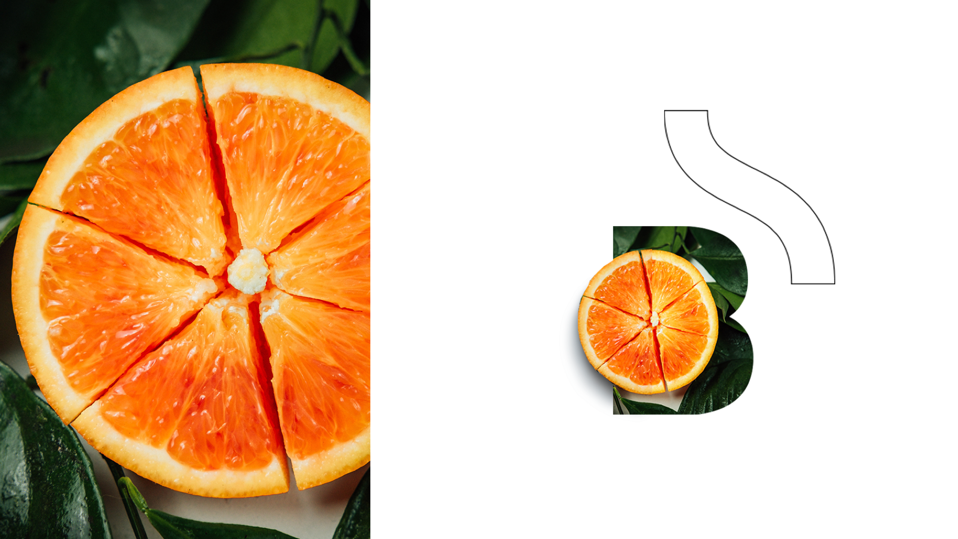

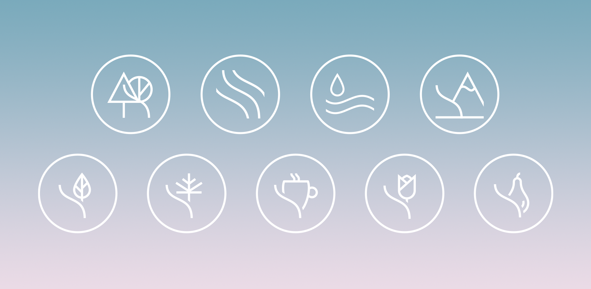
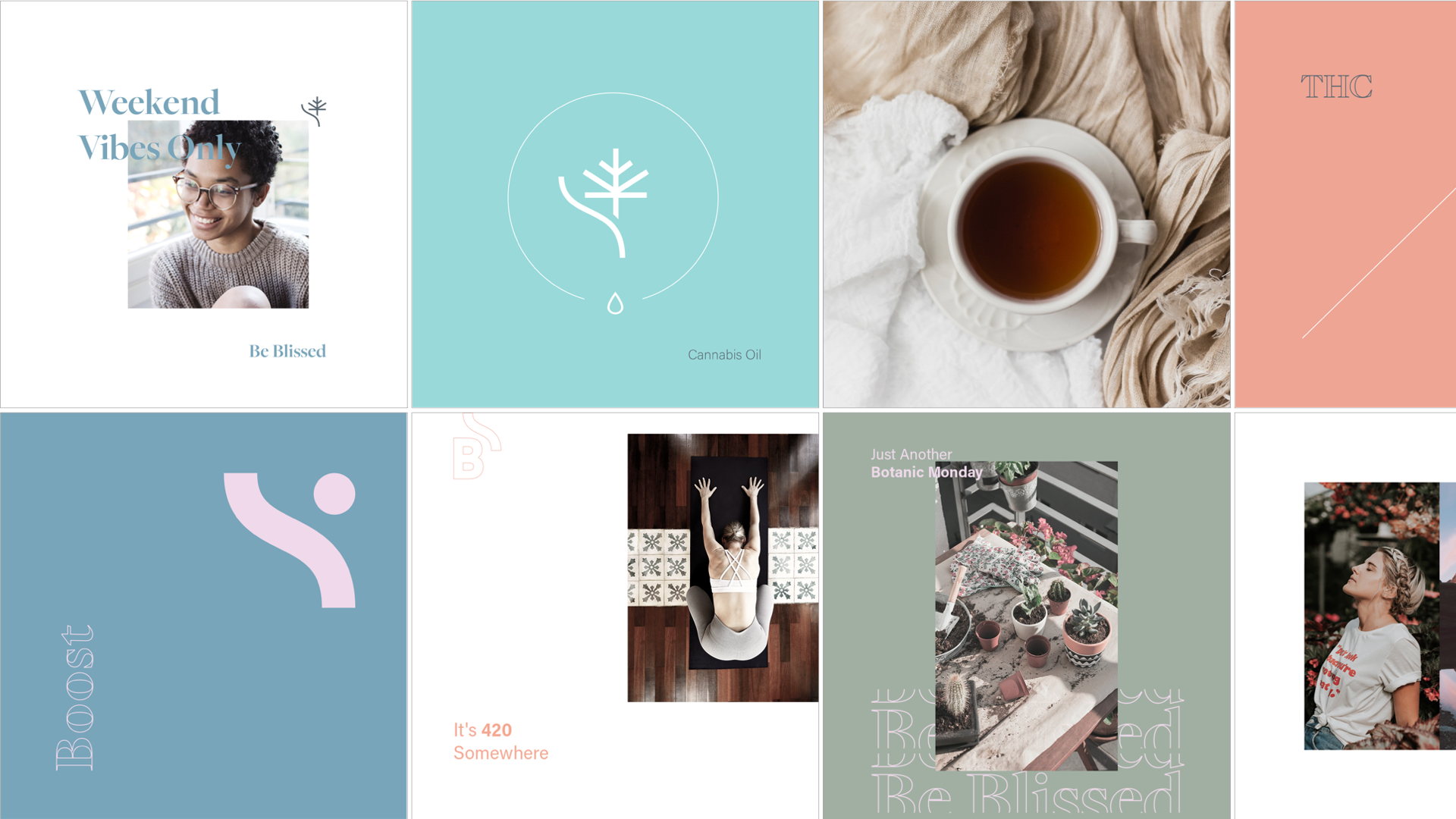
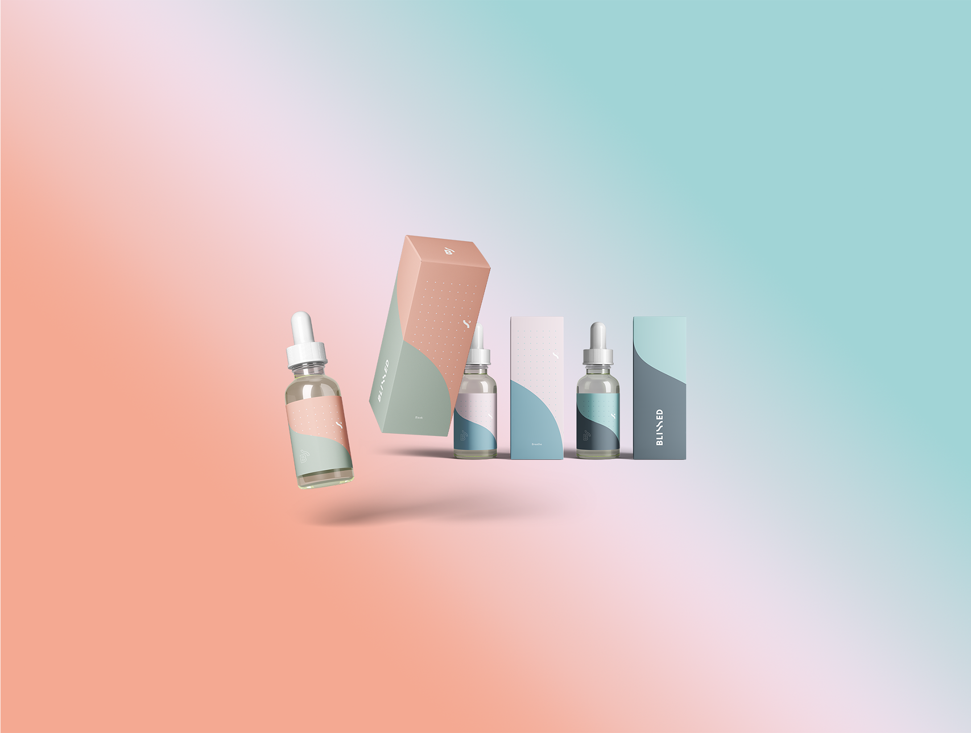
Product Icons
The Blissed wave was then adapted to create icons for each of the three products; one that was only THC, one combo, and one only CBD. Each product has its own thoughtfully picked colour combo.
The wave as an icon was also extended to create other brand elements; icons, illustrations, frames, patterns, and more.