The Ask
Develop a Brand Identity for Capzul, an agency offering Security for the Tech Industry.
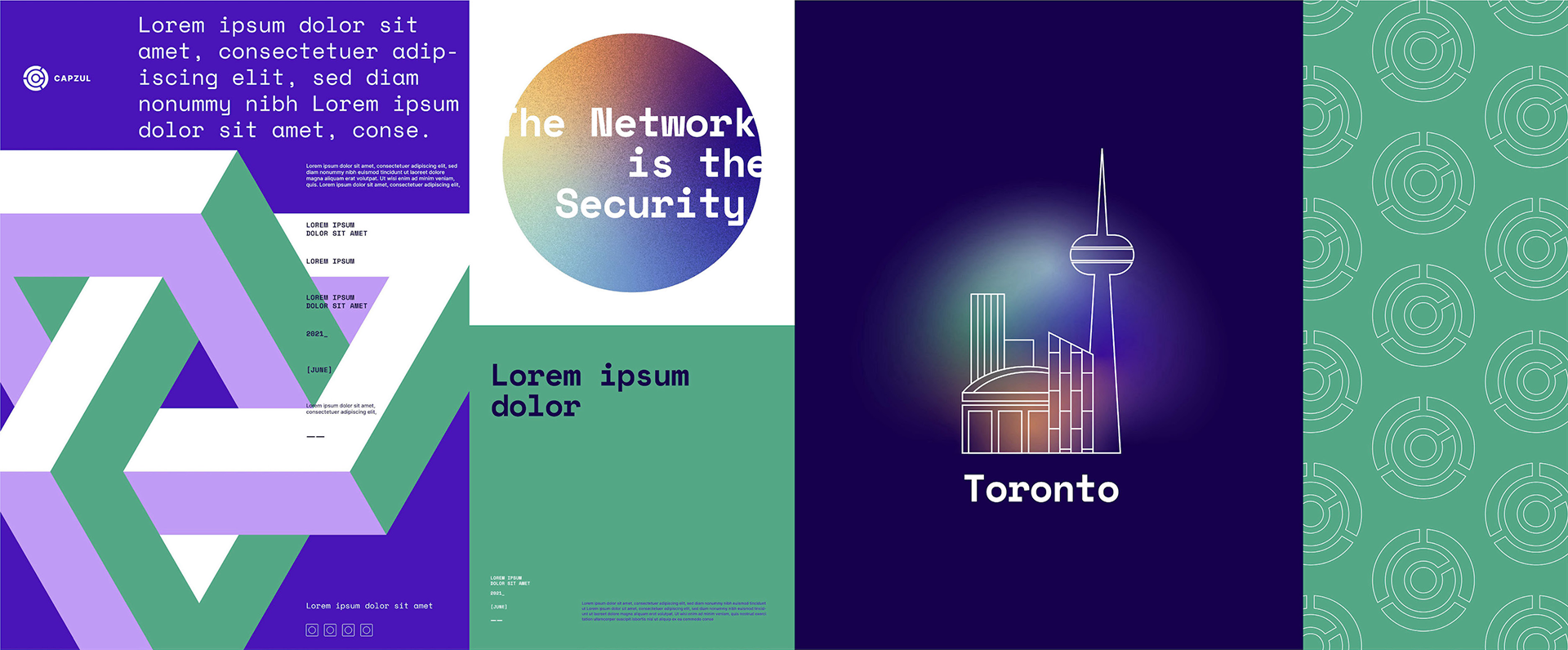
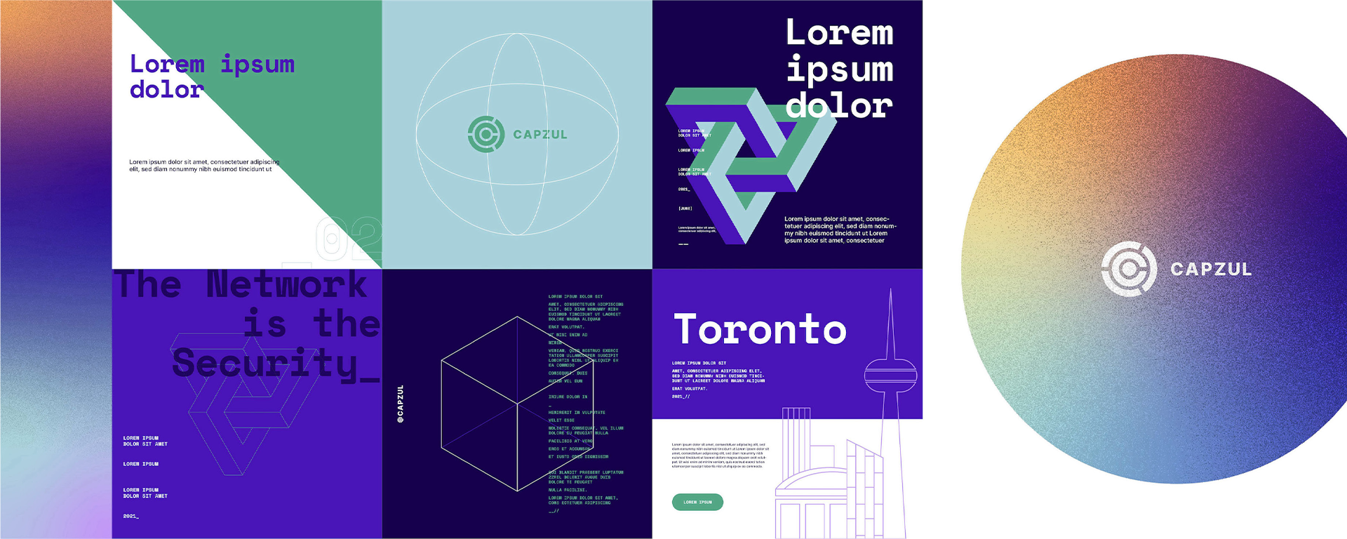
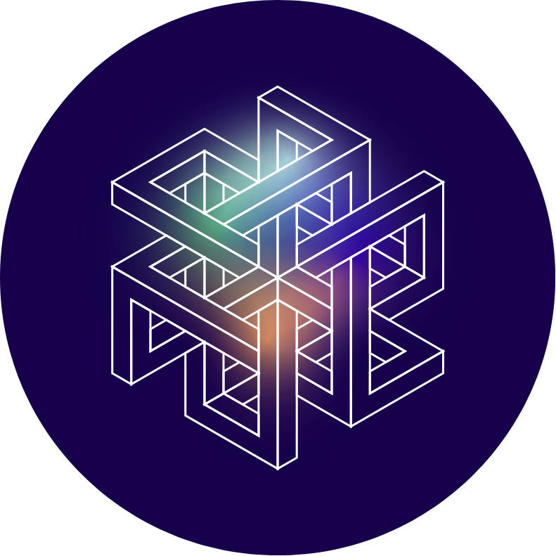
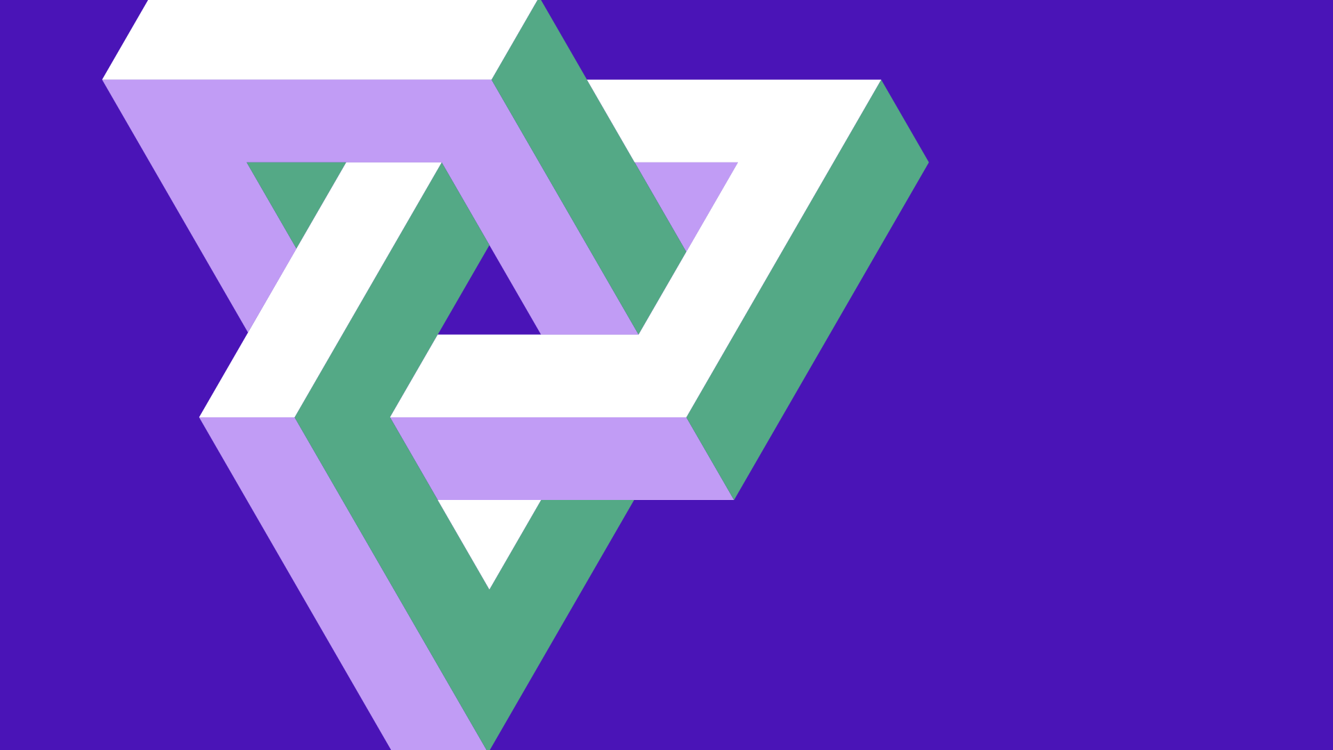
This concept was called “The Network is the Security”. Capzul has created an entirely new system for securing your network throughout rather than just a shield. Using 3D optical illusions to represent how the network is constantly regenerating to remain secure, and the tangled nature representing how impossible it is to break into.

PRIMARY
MONOGRAM
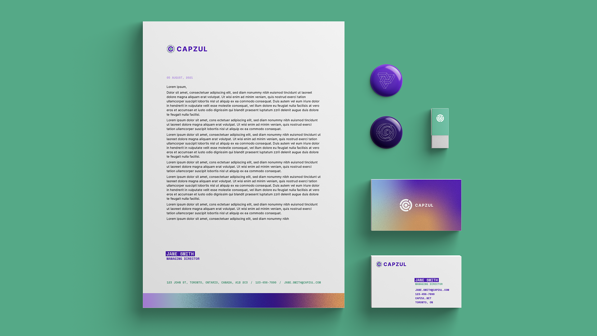
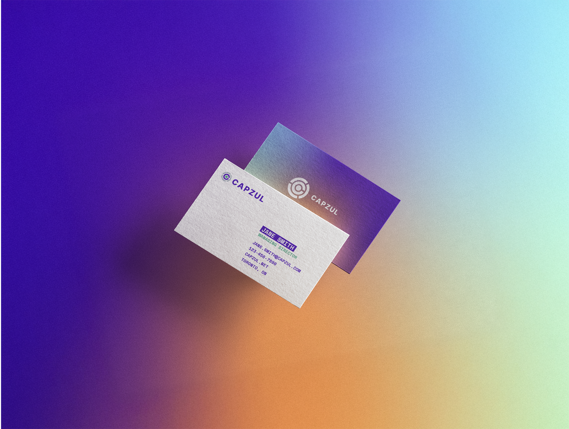
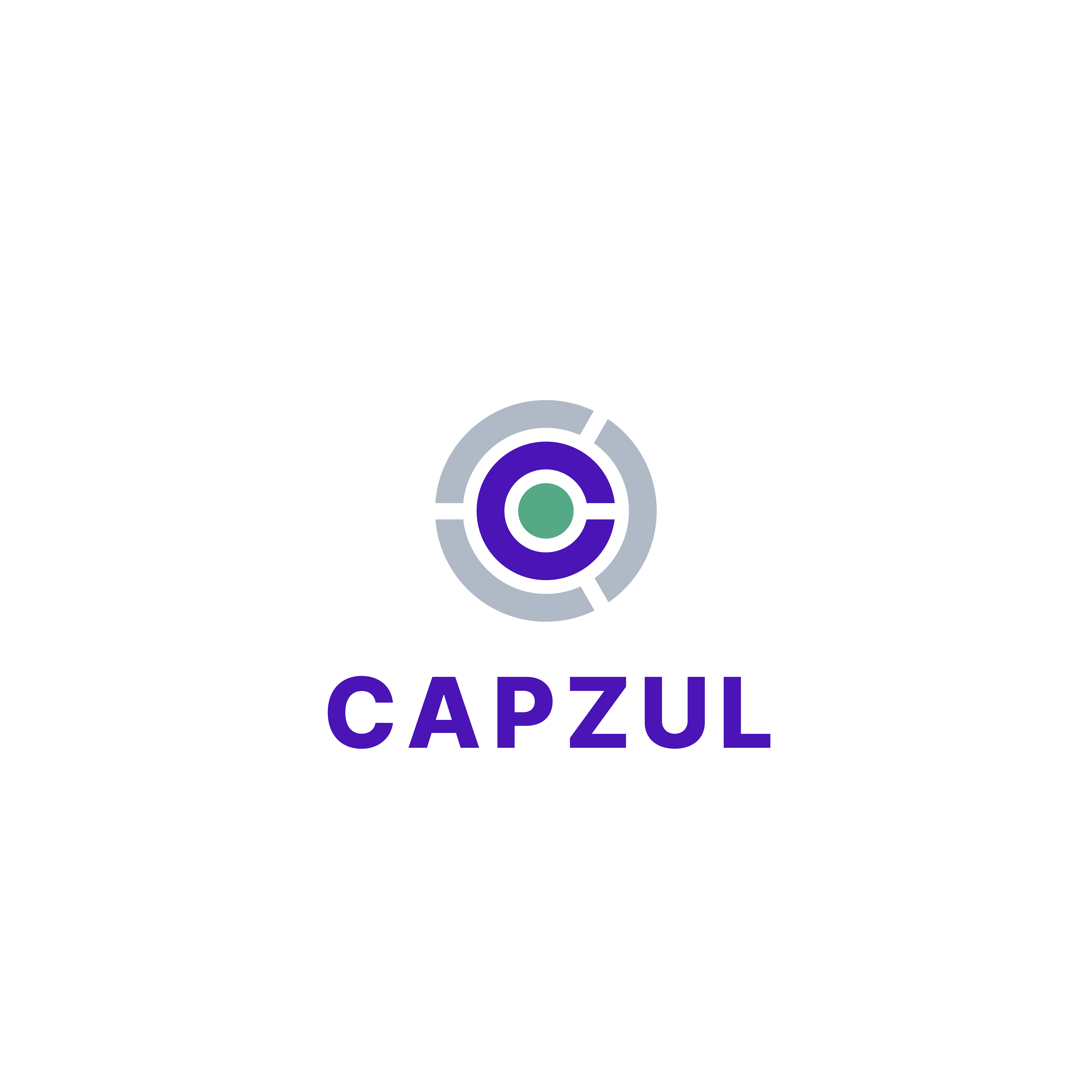
The Logo
The logo was not changed drastically from the original, as it was distinct and recognizable. I made minor adjustments to the type, colours and the proportions of the monogram. The colours were made slightly more saturated to fit into the digital tech world. Several versions of the logo was made for various uses; in presentations, on printed materials, websites, etc.
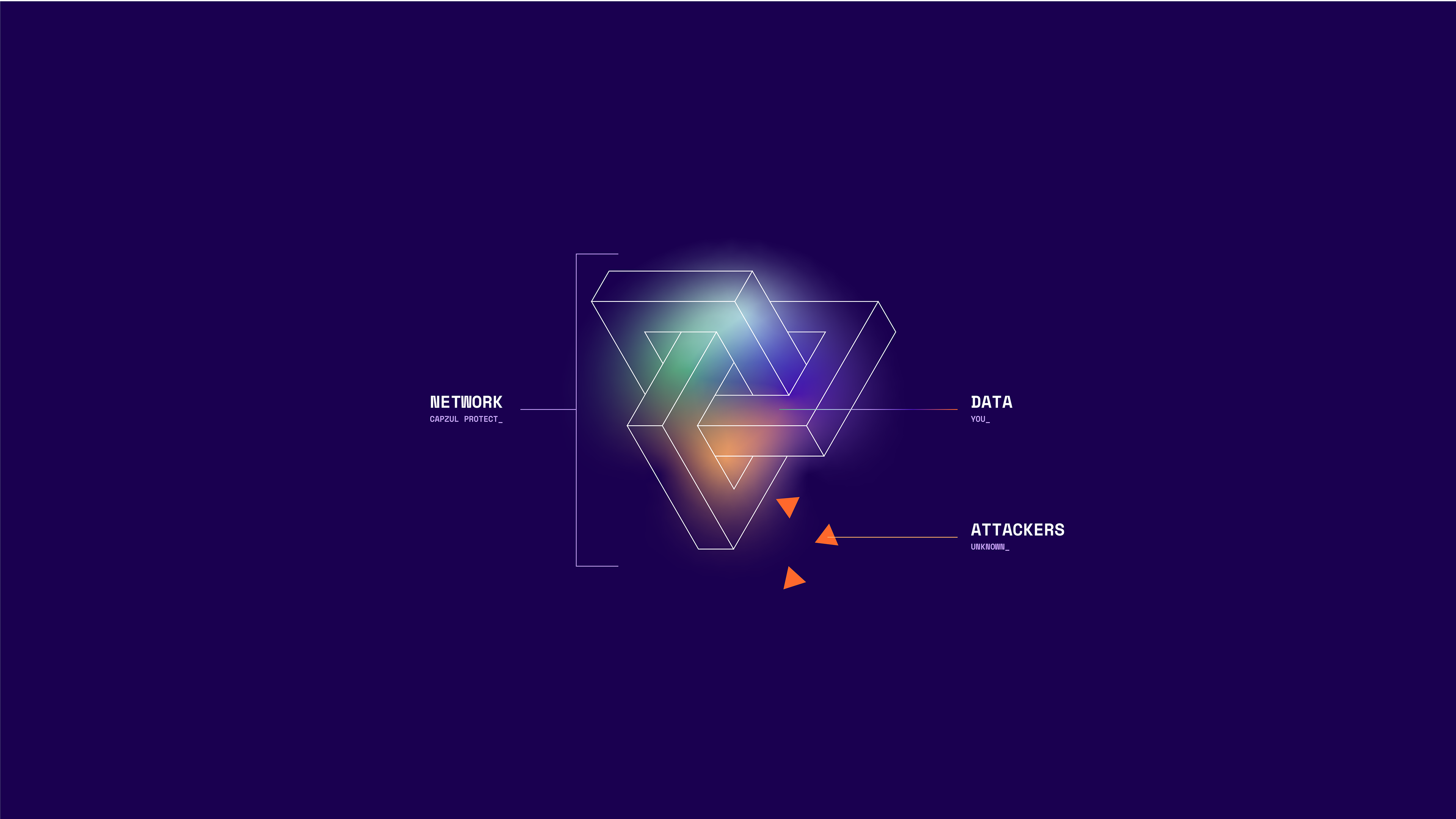
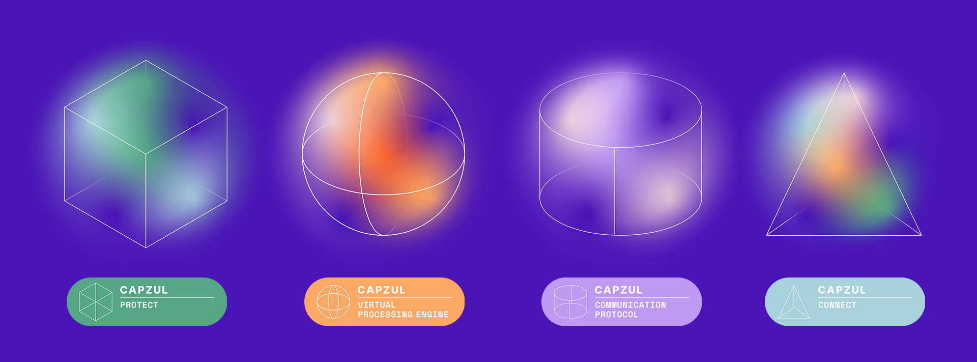
3D Illusions
The shapes were built to use in videos communicating Capzul’s offering; they represent the nature of the system that protects your data. Constantly shifting, regenerating, the entire system is impenetrable. These were then animated to show the ever-changing nature of their system.


Icons
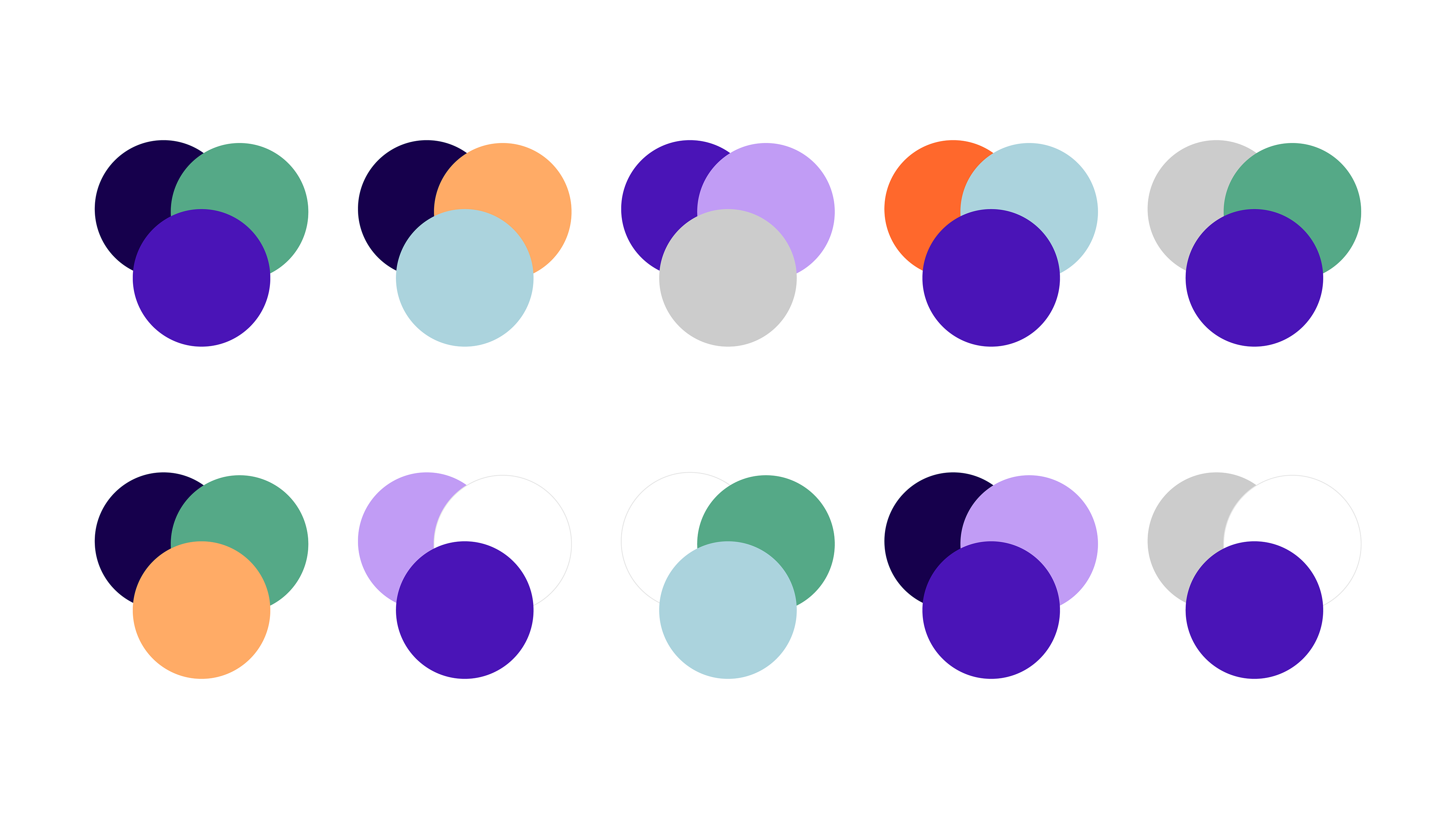
The style was then used to create icons to identify each of Capzul’s product offerings, along with its own limited colour palette.