The Ask
Design the logo and branding for the Integral Yoga Institue based in New York. The studio is famous for essentially popularizing yoga practice in the US, it was founded in 1966. I wanted this brand to represent its roots in the 1960’s as opposed to today’s Wellness studios that are most common. This studio practiced every part of yoga, beyond just a trendy workout. They study the spiritual aspect, and offer training classes for instructors and retreats.
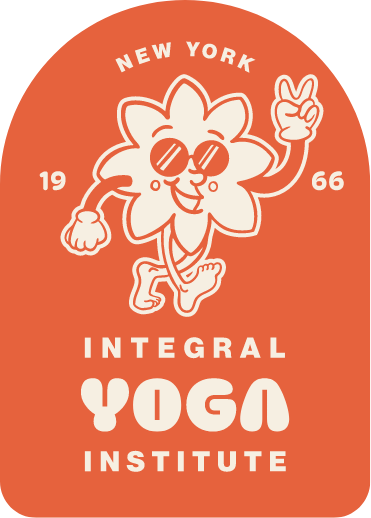
The Logo
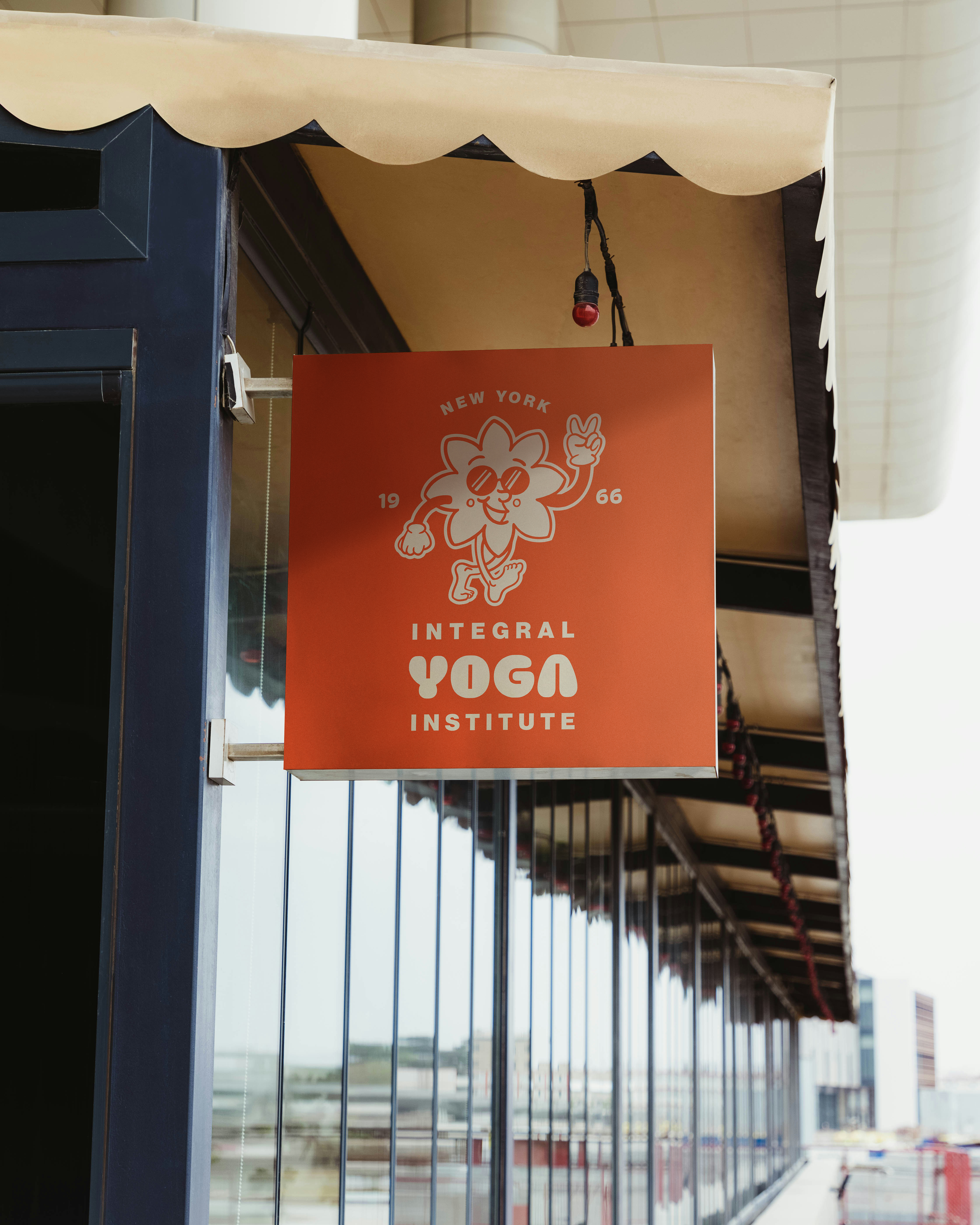
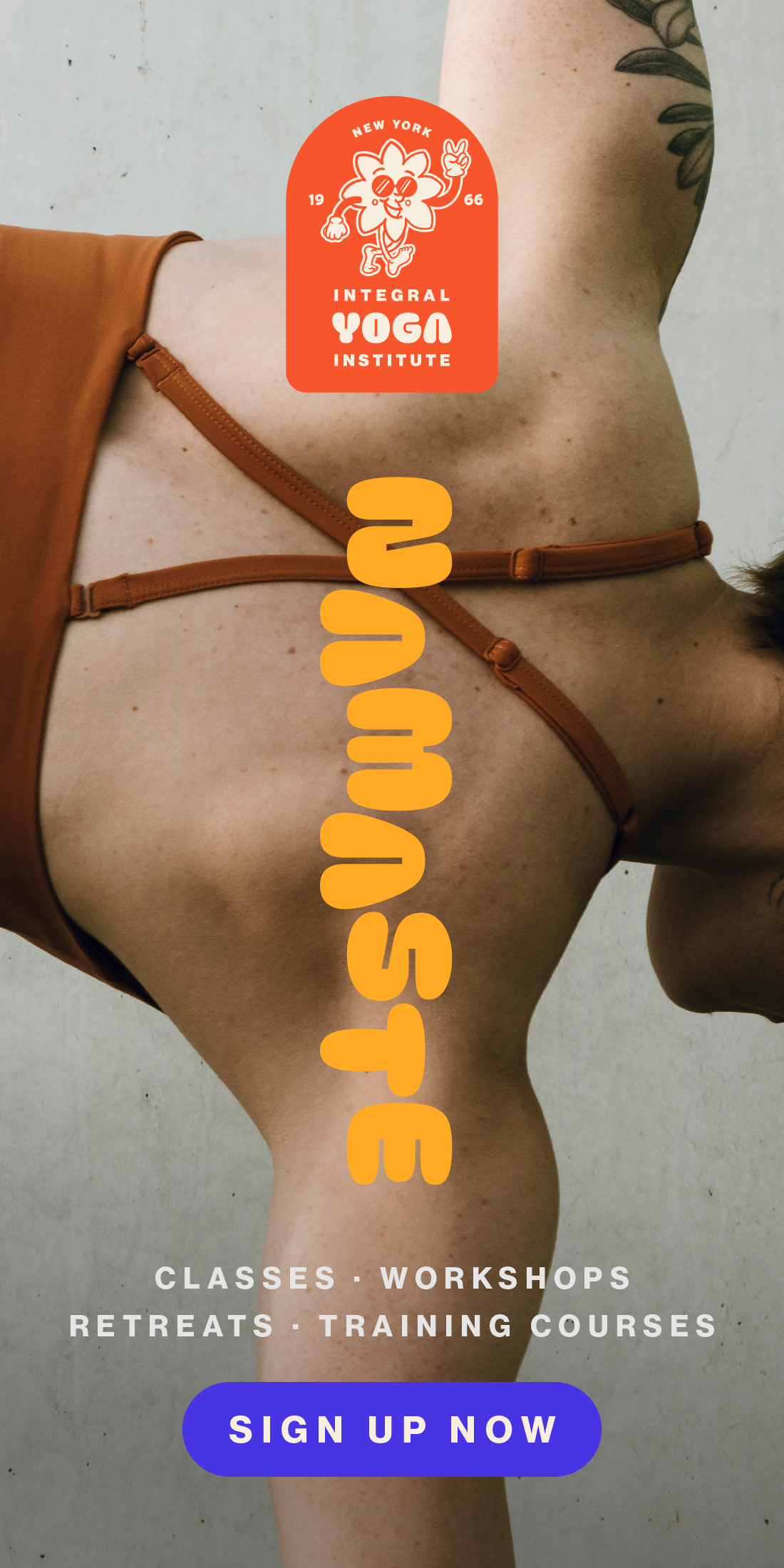
As I wanted this brand to really demonstrate its original roots and mission from the 1966, I looked to the design of that period. Quirky mascots, rubber hose characters, were extremely popular. The lotus is a classic icon of yoga and Buddhist spirituality, so it was a perfect choice to create a rubber hose character.
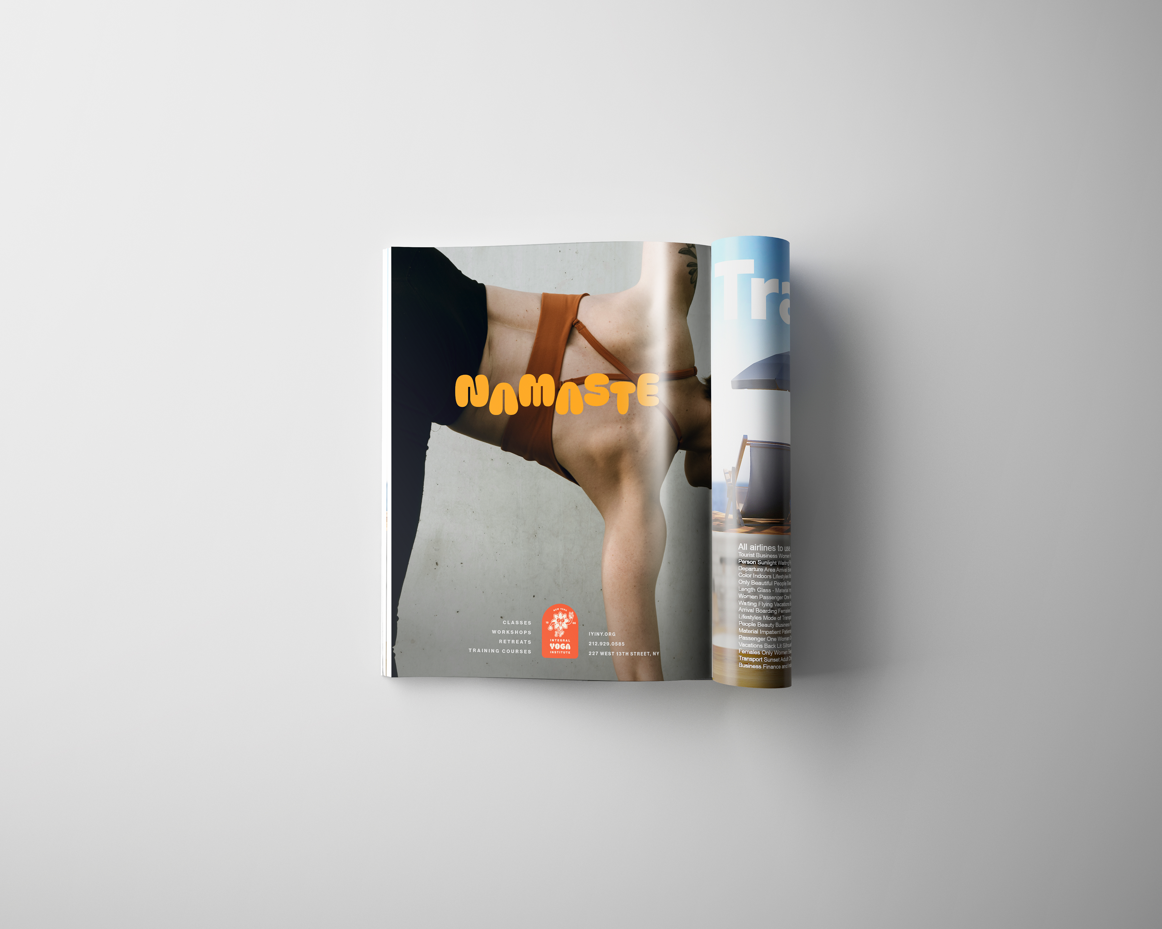
The sunglasses and peace finger sign were added to reference the hippie movement in the 1960’s, yoga and spirituality were very closely related. There was also a feeling of acceptance in this space at this time, something that I feel yoga, exercise, and wellness sphere of today is severely lacking. I wanted this brand to feel just as open and welcoming as it had been when it was founded.
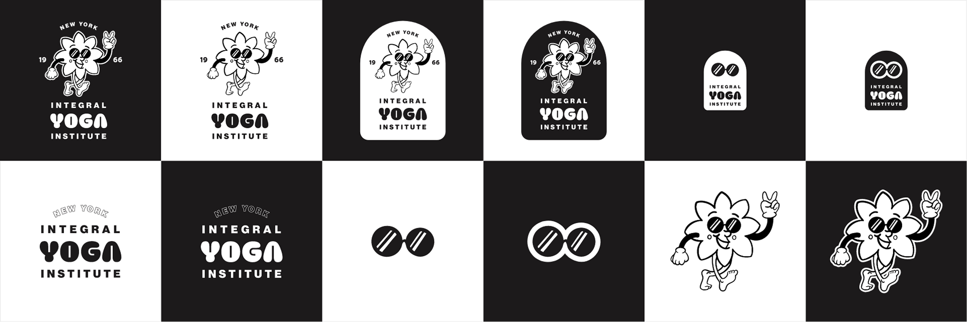
secondary Logos
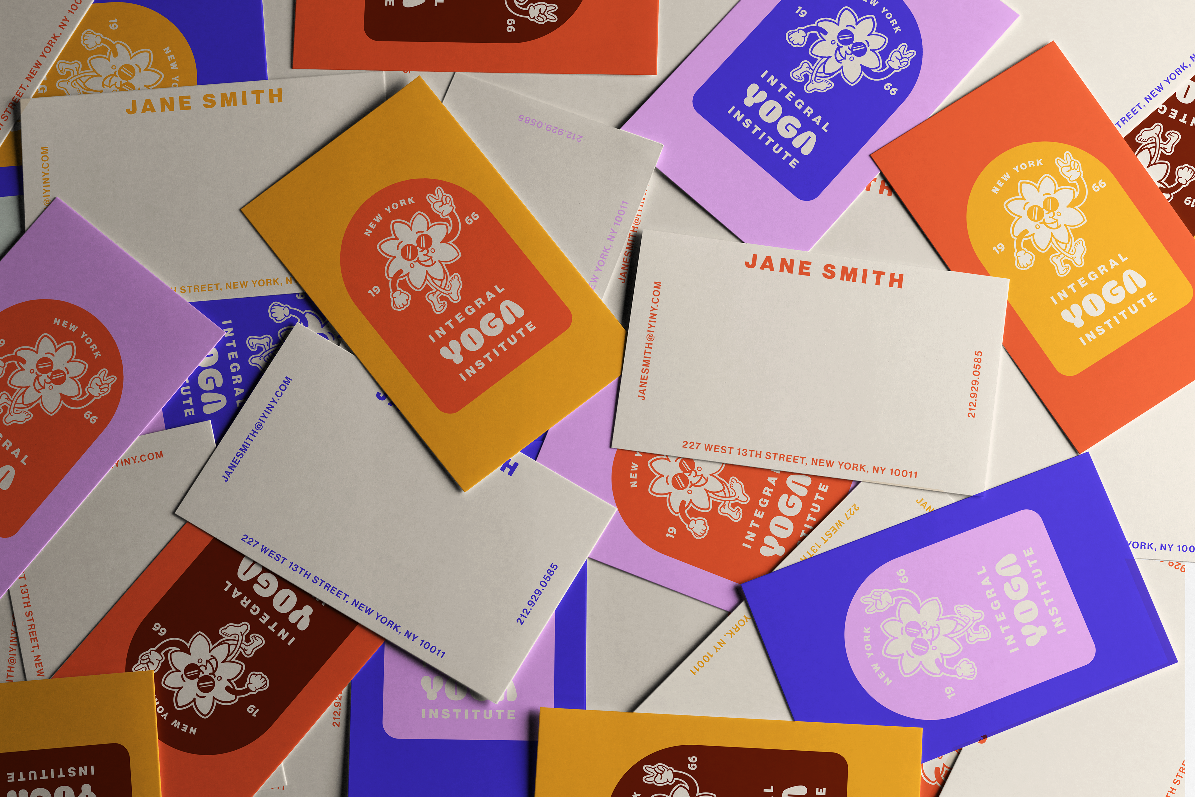
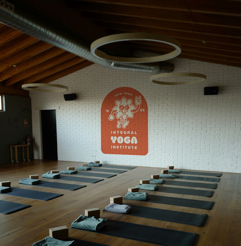
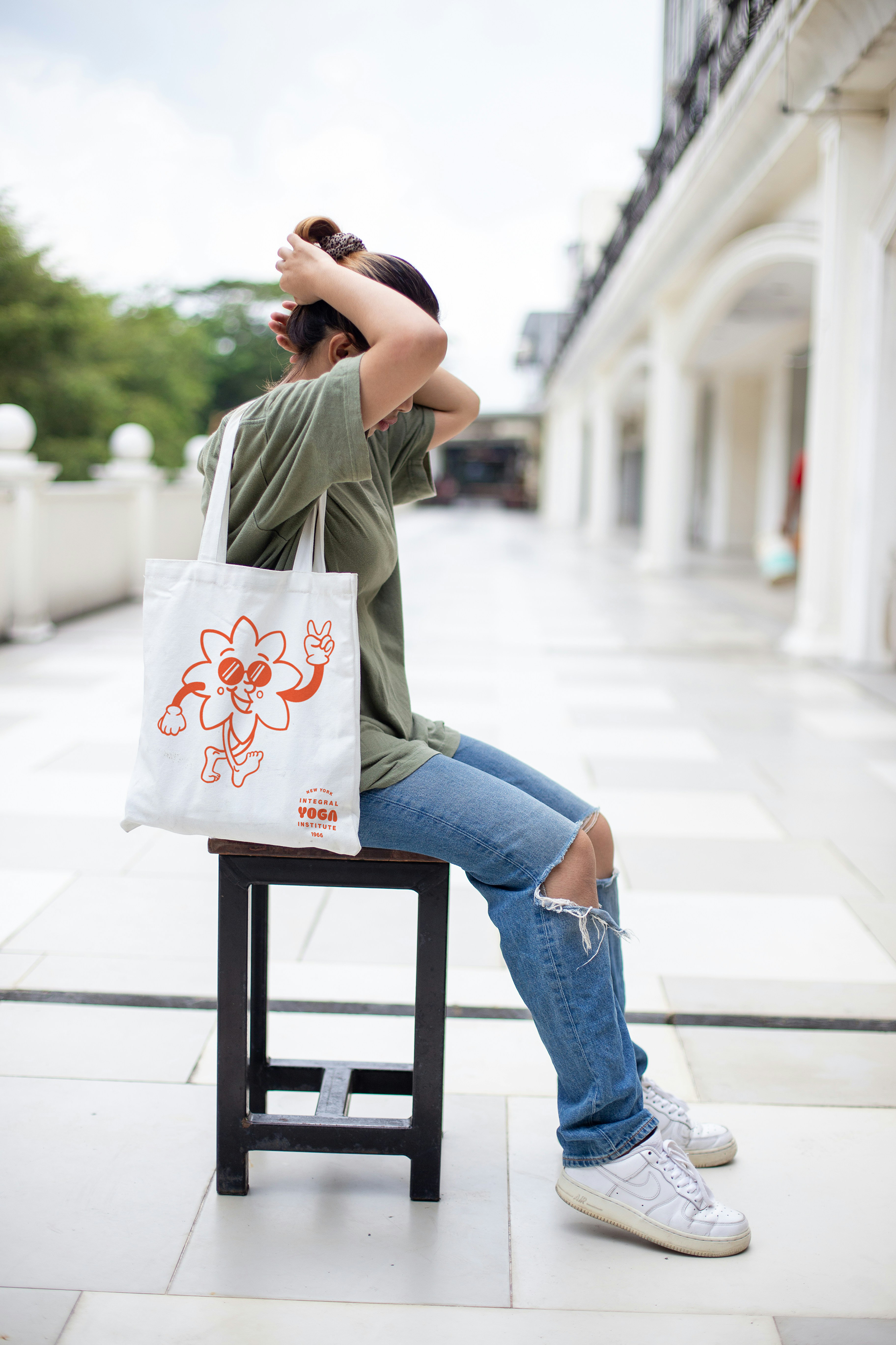
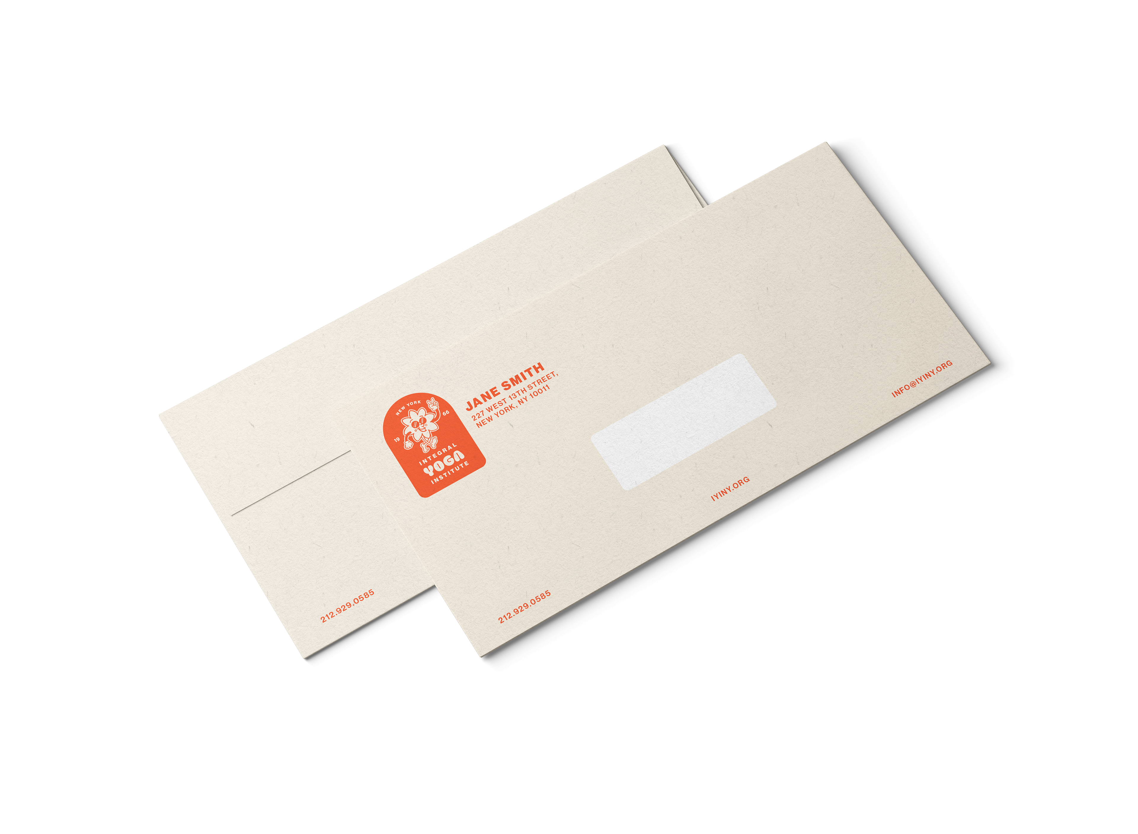
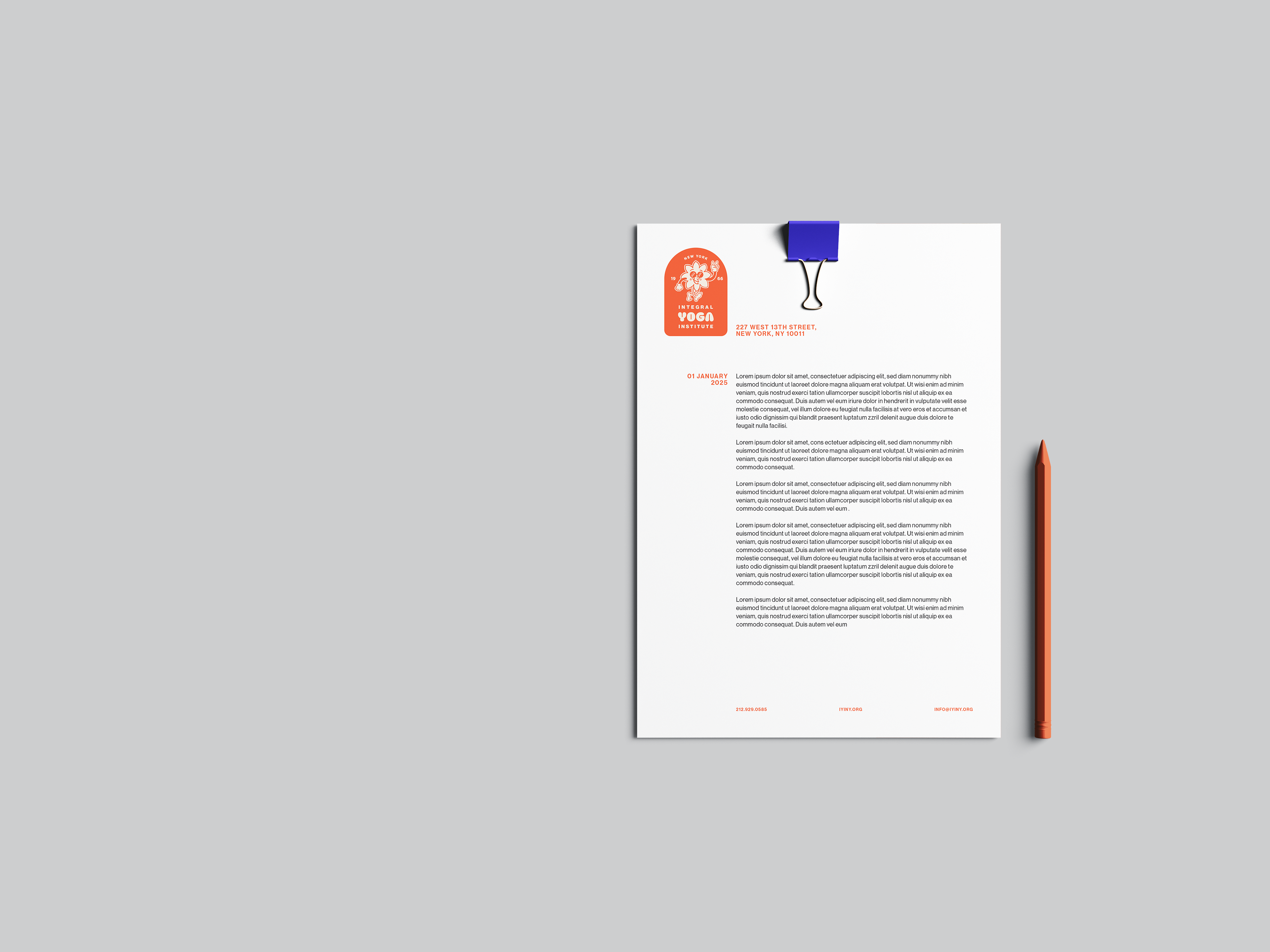
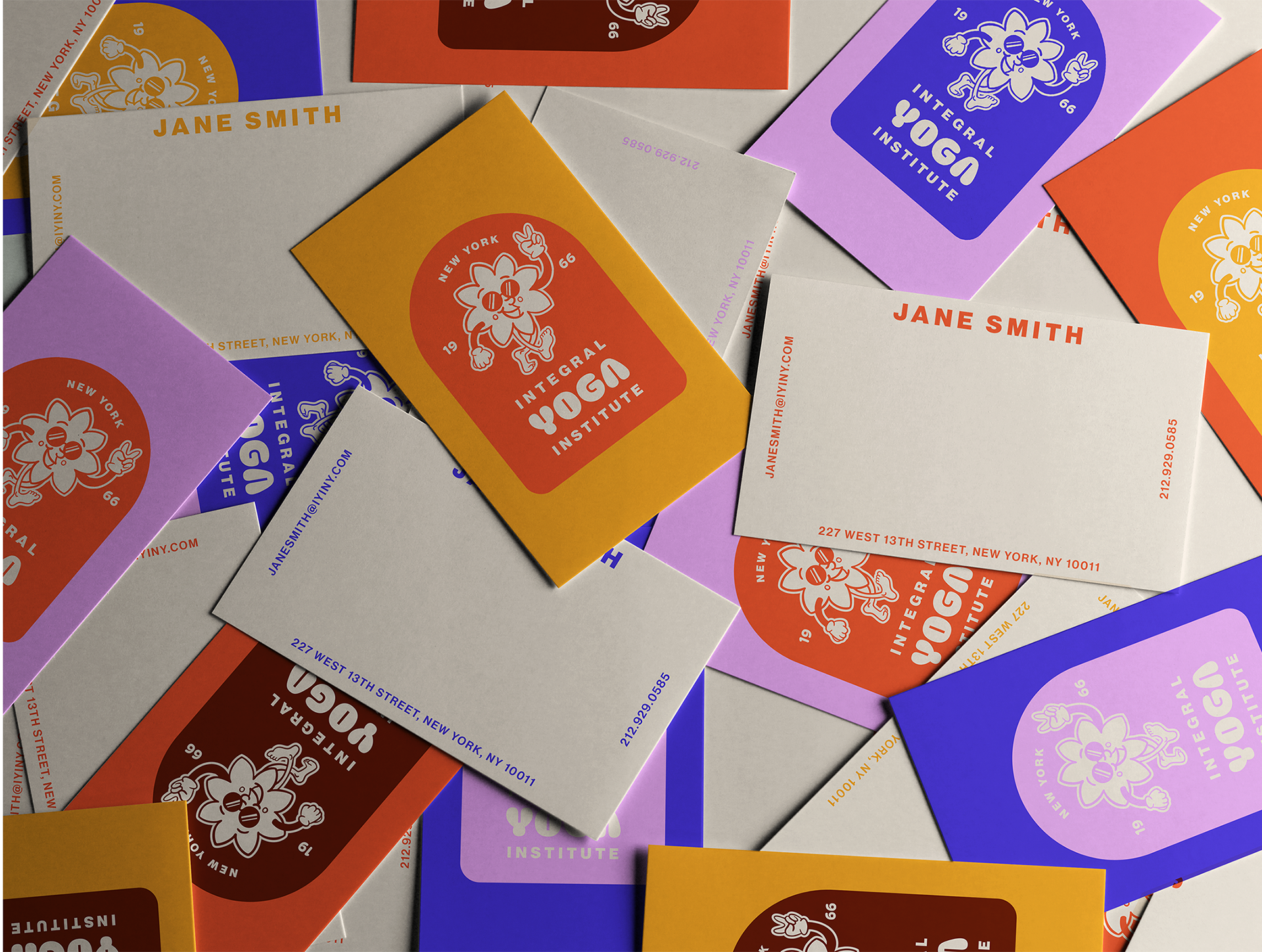
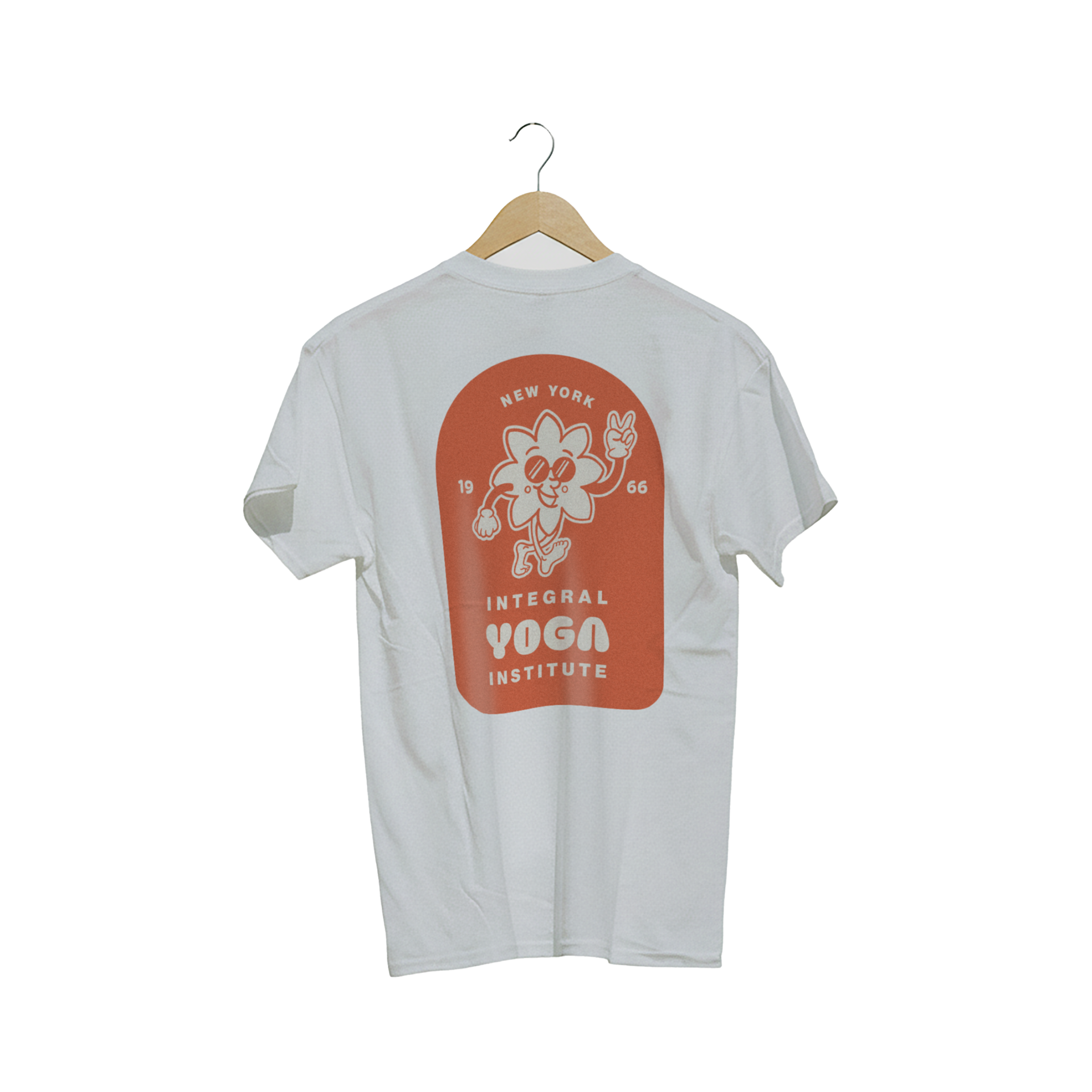
I created secondary versions of the logos to be used across a variety of platforms; the primary badge would be used on signs, business cards, websites etc. But with multiple digital platforms available, and branded swag being essential, there needed to be some variety.
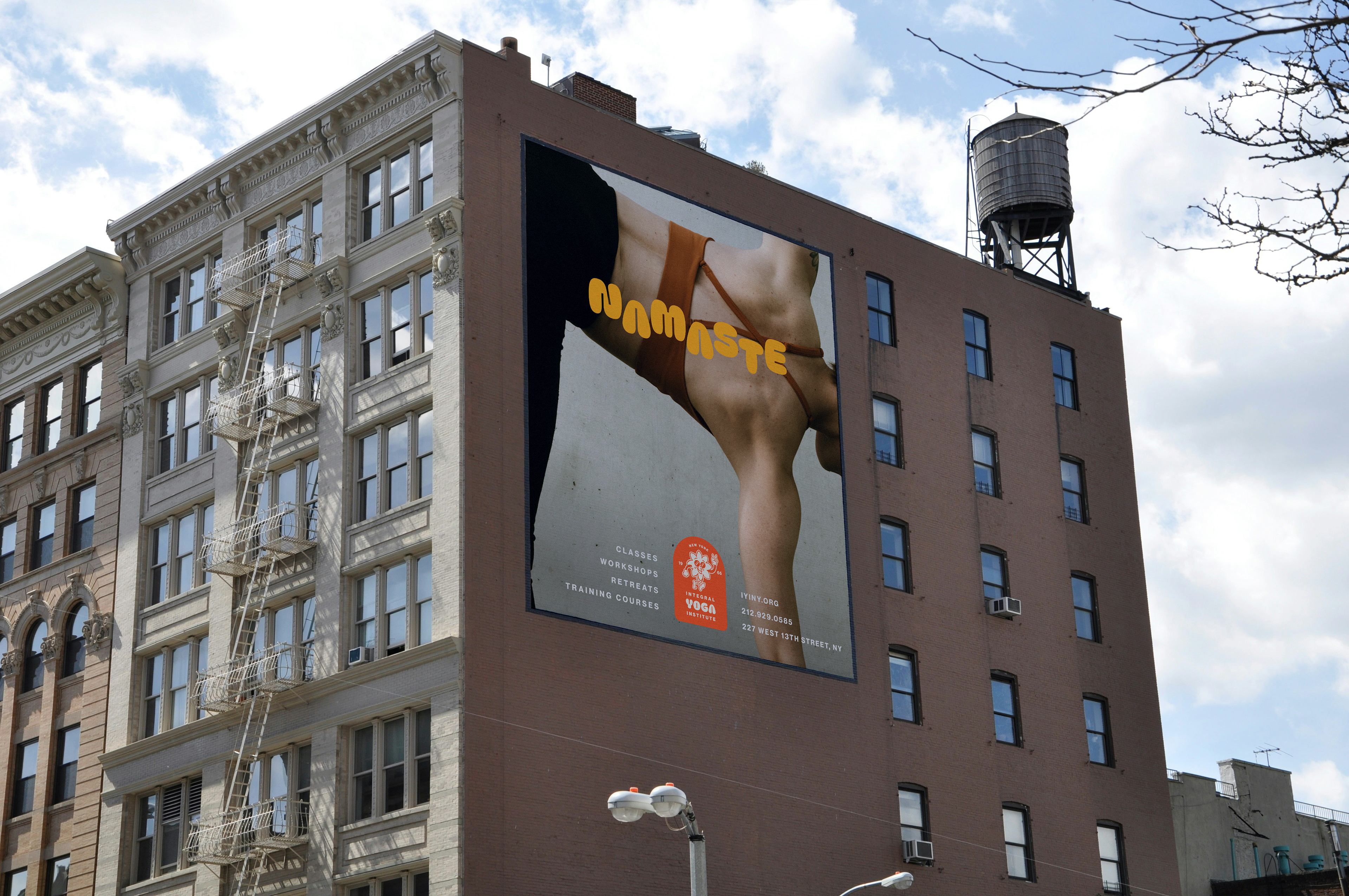
Smaller versions featuring just the glasses could be used for social media avatars or favicon. The mascot itself could be used for swag and social media content. And a simple word mark to combine with other brand elements. Using ‘New York’ at the top of the logo alongside it to be replaced for their other studio locations.
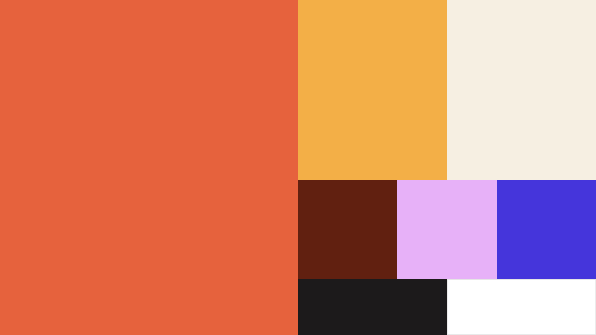
Colour Palette
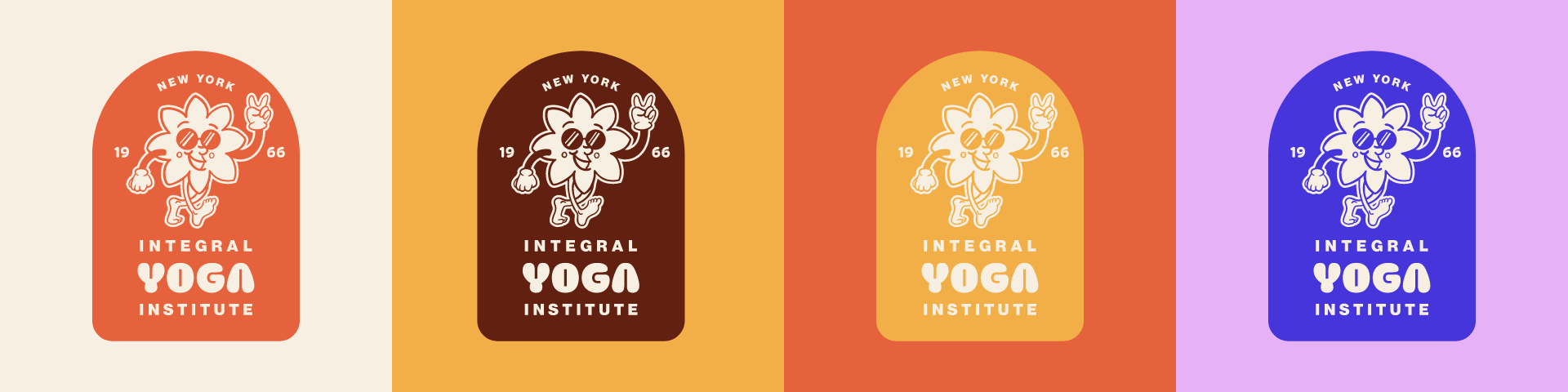
I wanted the colour palette to be bright and flexible, referencing colours related to yoga, the history of the studio, the 60’s, while also still demonstrating the welcoming vibe of the brand. The existing brand uses the same orange and a medium dark blue, not far off from the ultra-violet purple I used.
Building on their current palette, I’ve added some more colours to create that flexibility. Different colour combinations represent the different aspects of yoga, as well as the different people. The oranges and deep red are a direct reference to India and the monks that practiced yoga. The ultra-violet purple brings the whole palette into the modern, digital age.